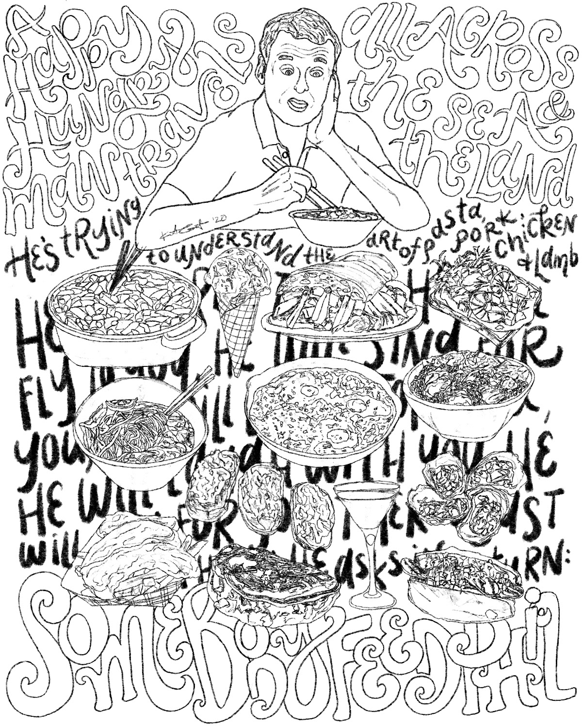
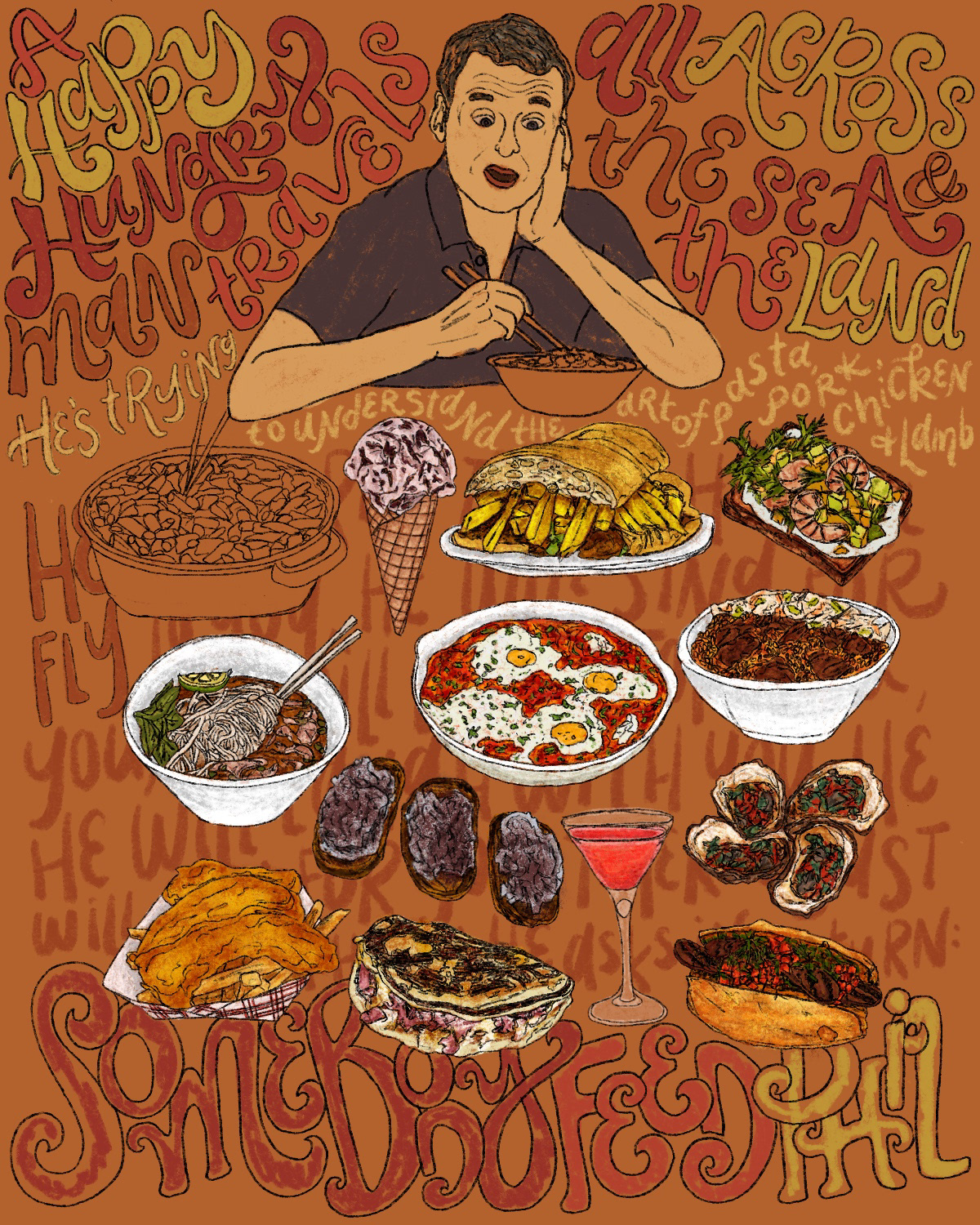
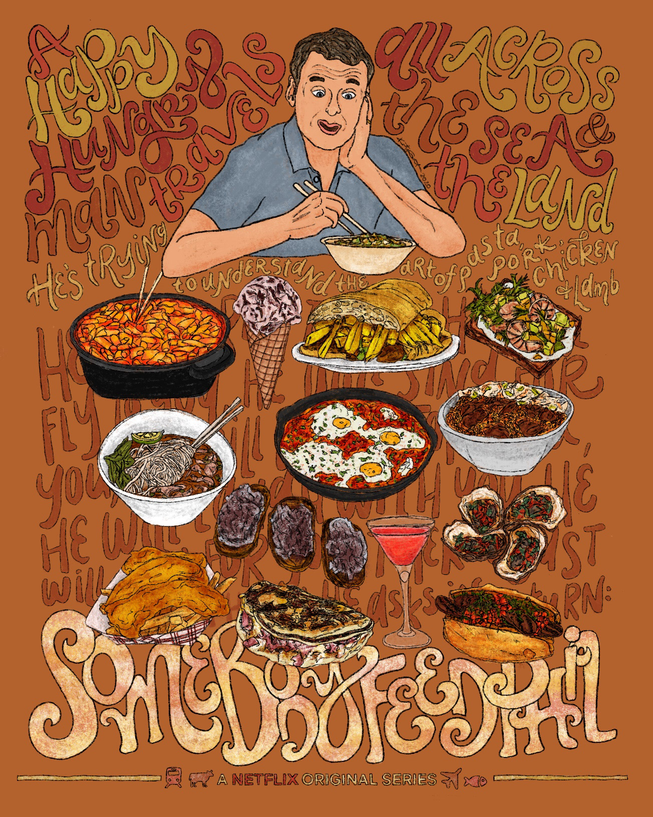
Project: My entry for the #EatWithPhil contest, in which both my husband and I were semi-finalists for both of our entries!
I’ve thought a lot about how much food builds community amongst people; it’s an opportunity to expand and share the cultural and historical significance of food, which is FASCINATING to me. A quote from Phil during one of his seasons of "Somebody Feed Phil" that I wrote down & think about daily is: “Culture, countries, and cities are better when there is a huge diverse population.” Y E S.
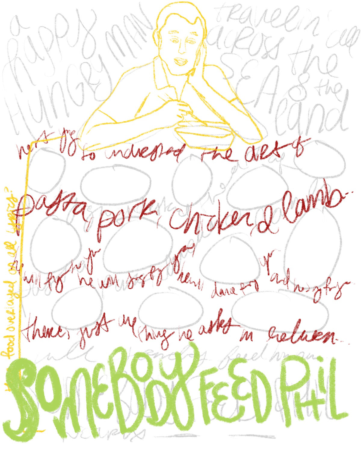
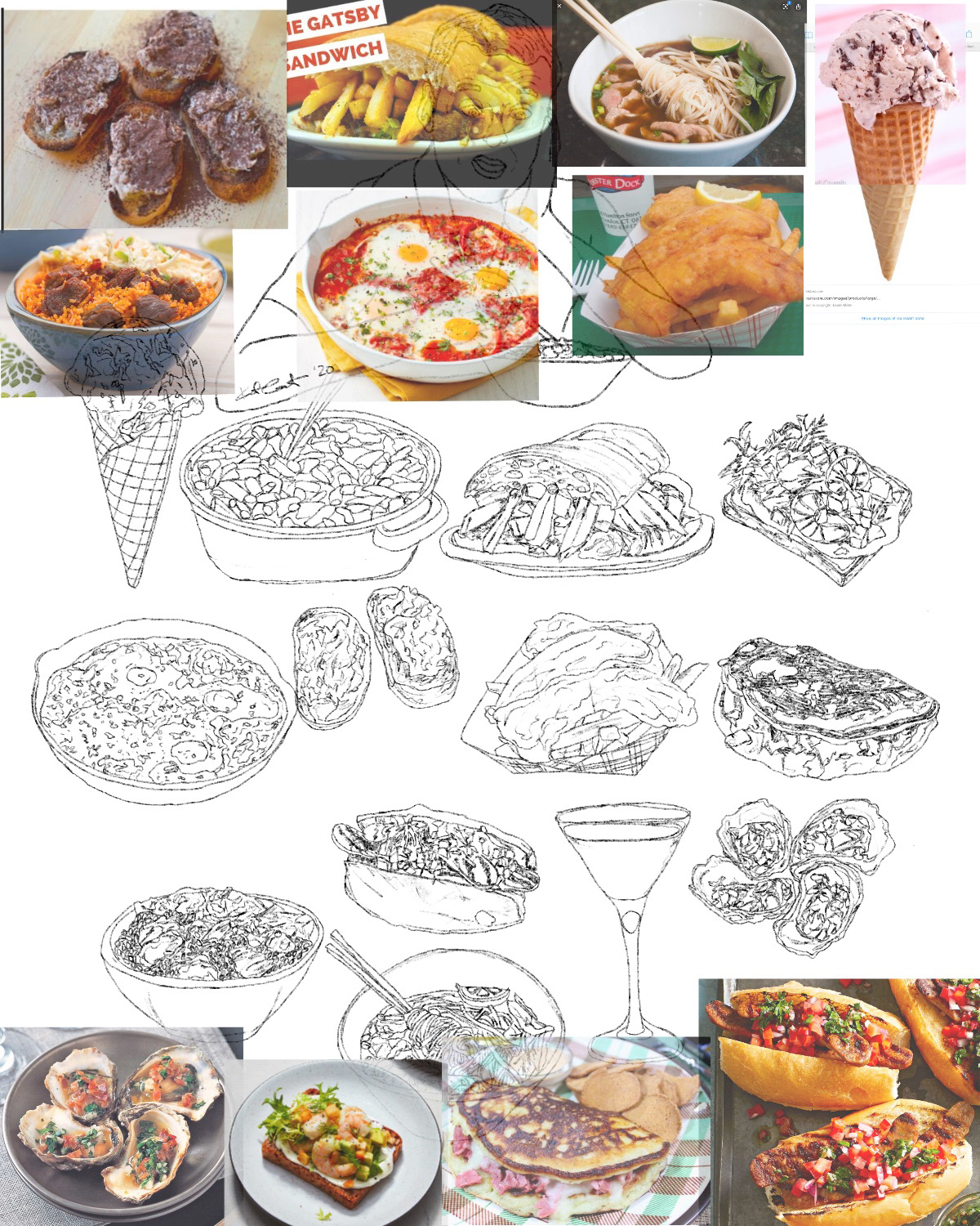
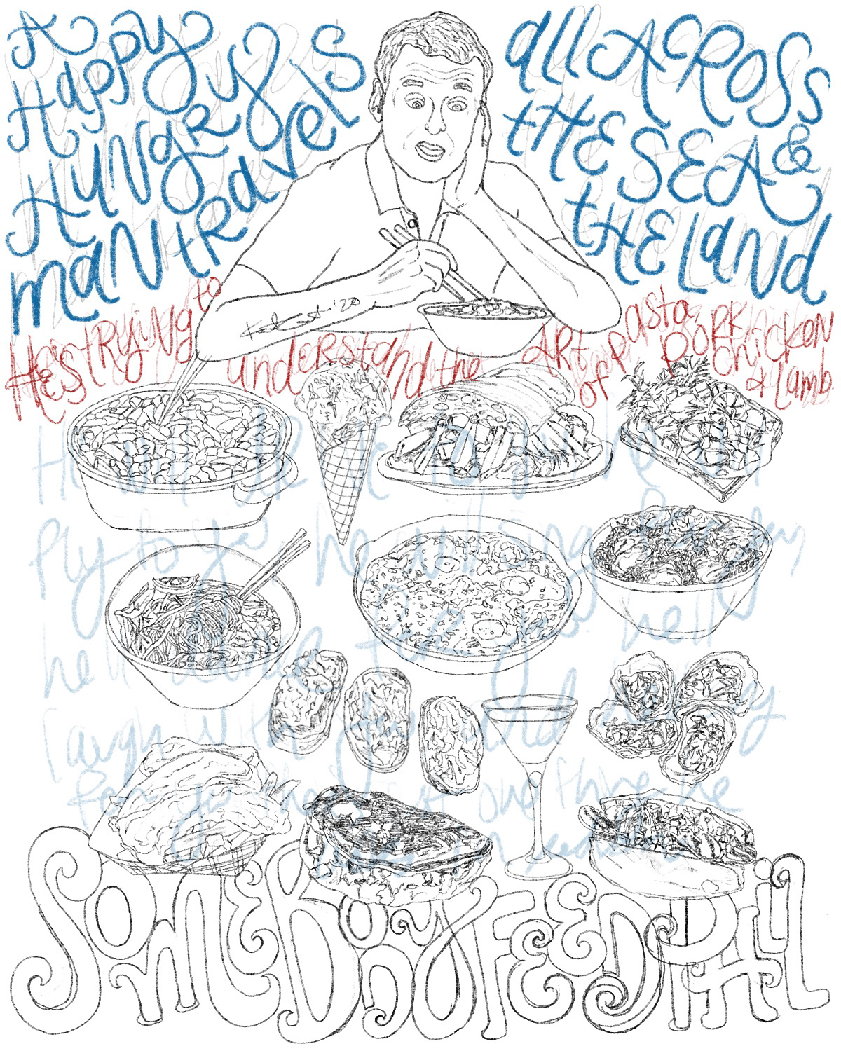
I was asked about my “process” in terms of art making, and so instead of showing a time-lapse glimpse into this, I thought it’d be fun to show some steps of start to finish: broad sketches, composition adjustments, lettering tweaks, etc. All of the foods illustrated here are from episodes of his show, and all of the original lettering is the lyrics to his theme song.
As for the video: My favorite collaboration to date with my incredible husband. 🤤 The video was @michaelhousemedia’s entry, and I had the pleasure of helping him with some illustrations, as well as being the person to chop all the food super awkwardly.
We filmed over the course of quite a few days. The first few shoots were to do things like roll the tomatoes down the wall and onto the table with a ramp made from a board or to create a trampoline from a picture frame and some elastic clothing to propel the chocolate bits in the air. Michael’s always incredibly smart, crafty, and full of ingenuity; he made a forest for a park scene out of asparagus, and leafy greens from our garden!
Our next couple of days involved a lot of cutting, dripping, smashing, and throwing food in the kitchen set-up. There are probably enough bloopers of all the way it went wrong to create a video just as long as our final submission!
Anyways, Phil — if you’re reading this, please hit me up any time you need a food illustration. Also, I think we should create a children’s book about food & travel together. Are you in? Please? Yes? Okay!
Tools: Procreate.
